WordPress is the web application collection of PHP program behind thirty four percent (43%) of the internet’s websites, and fifteen percent (50%) of the top one hundred websites in the world, so if you’re considering it for your website then you’re perhaps thinking in the right direction. Small start-up projects a community website or even a small personal owned blog or mid to even large business presentation site can benefit greatly from setting up their Web Platrform or Ecommerce shops on a WordPress website platform (that of itself depends just on a small number of technologies such as a Linux server with a Web Server installed on it to serve PHP as well as some kind of Linux host installed Database backend engine such as MYSQL / PostgreSQL etc. …
But if you really want to create a successful ecommerce website on WordPress, that can seem a little intimidating at first as the general complexity to start up with WordPress looks very scary in the beginning. However in this article I’ll point to fewhelpful hints should get you off on the right foot, and make your entry into the world of Wodpress / WP Ecommerce a little easier and less scary.
This article is to be less technical than expected and in that will contrast slightly with many of the articles on this blog, the target audience is more of Web Marketing Manager or a Start-up Search Engine Optimization person at a small personal project or employed in the big bad corporate world.This is no something new that is going to be outlined in this article but a general rules that are known for the professional SEO Gurus but is most likely to be helpful for the starting persons.
If you happen to be one of these you should know you have to follow a set of well known rules on the website structure text, descriptions, text, orientation, ordering of menus and data etc. in order to have the WordPress based website running at full speed attracting more visitors to your site.
Photos

Although the text for your website is very important – more on that later – when a user first opens up your website in their browser, their eyes are going to be caught by the images that you have laid out on your website. Not using images is a big mistake, since it bores users’ eyes and makes your website seem amateur and basic, but using low quality images or irrelevant images can also harm your chances of appearing authentic to a user (yes here on this blog there are some of this low quality pictures but this is due to fact this website is more of information blog and not ecommerce. Thus at best case always make sure that you find the best, high-quality images for your website – make sure that you have the correct rights to use the images as well (as copyright infrignmenets) could cause you even a law suits ending in hundred or thousand dollar fines or even if this doesn't happen any publicity of such would reduce your website indexing rating. The images placed should always be relevant to your website. If you find a breath-taking sunset or tech-gadget picture, that’s great, but maybe not for your healthy food ecommerce store, but for your personal ranting or describing a personal experience.
Product Photos

Assuming that sooner or later even if you have a community website you will want to monerize it to bring back to yourself in material form at least part of the many years effort to bring the site to the web rank gained.
Leading on from that point, you’re going to be selling or advertise items – that’s the whole point of ecommerce. But users often find ads / online shopping frustrating due to not being able to properly see and understand what they’re buying before they make their purchase. This can lead to ‘buyer’s remorse’, and, consequently, refunds galore, which is not what you want. Make sure that images of your products are always available and of a high quality – investing in a fairly high quality camera might be a good idea – and consider many pictures for different angles or even rotating images so that the user can decide for themself which angle they want to look at.
Engaging Descriptions
“I can guarantee that you can’t remember the last five product descriptions you read – not even word-for-word, but the general ideas and vocabulary used will have been tossed into your short-term memory and forgotten in an instant. This is where your website can shine, and become better than ninety percent of those lingering on the internet,” Matthew Kelly, a project manager at WriteMyX and NextCoursework, suggests, “since putting effort into writing your product descriptions and making them lively and engaging will make your website memorable, and your subscribers will turn helpfully soon loyal customers will be more likely to come back time and time again and become repeat business, as well as mention you to their friends (social mounth to mouth marketing) and that way working as free advertising for you and making your website incredibly effective.”
Mobile-Friendly

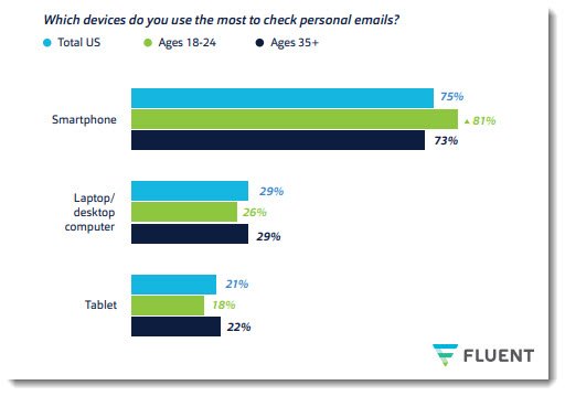
Which device is most used to check email Laptop / PC or Mobile statistics as of year 2019
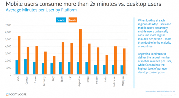
These days with the bloom of Mobile Devices that are currently overrunning the user of normal Desktop PCs, Laptops and Tablets and this trend is likely to stay and even increase, “If your website isn’t mobile-friendly in this day and age, then you won’t get anywhere with it.” Anne Baker, a marketer at BritStudent and Australia2Write, states. “Most people use their phones when they access websites, especially when they go shopping on the internet.

Statistics on user stay (secs / mins) stay on a website from Desktop PC and Mobile devices
On WordPress, this means finding a more recent theme – an older theme, maybe four-five years old, will probably not support mobile, and you just can’t afford to lose out on the mobile market.” In short, find yourself a mobile-friendly theme or install the right WordPress Pluguin that will enable you to have a Mobile Friendly theme in case if blog is accessed from a Mobile Dev or many of your customers will become frustrated with the badly formatted ‘mobile’ version of your website that they end up using, which might be for instance meant for a much larger screen. It can also ruin the atmosphere (experience) created at the accessed user site and have negative impact on your audience opion of your site or business. This is even more the case if your website or webapp is targetting to be modern and keeping with the times – or especially if it deals with IT and electronics (where the competition is huge)!
Registration

Registration form (Sign Up) on a website and the overall business cycle idea behind web product or business is of critical importance as this is the point that will guarantee intimidation with the customer, failing to have the person be engaged will quickly make your website rank lower and your producs less wanted. The general rule here is to make your registration be an easy (to orientate for the user) and be present on a very visible place on the site.
Registration steps should be as less as possible as this might piss off the user and repel him out of the site before the registration is completed. Showing oportunity to register with a Pop-Up window (while the user clicks on a place showing interest for the produce might be useful in some cases but generally might also push the user back so if you decide to implement it do it with a lot of care (beware of too much aggressive marketing on our site).
An example
The registration process should be as intimidating as possible to leave joy in the user that might later return and log in to your site or ecommerce platform, e.g. be interested to stay for a longer time. The marketing tactic aiming to make the user stay for a longer time on the website (dragging his attention / interest to stuff) is nothing new by the way as it is well known marketing rule integrated in every supermarket you buy groceries, where all is made to keep you in the shop for as longer as possible. Research has shown that spending longer time within the supermarket makes the user buy more.

Returning customers can be intimidated with membership or a free gift (be it even virtual picture gift – free email whatever) or information store place could be given or if products are sold, registration will be obligatory to make them use their payment method or delivery address on next login to easify the buy out process. But if registration is convoluted and forced (e.g. user is somehow forced to become meber) then many customers will turn away and find another website for their shopping needs. Using a method like Quora’s ‘login to see more’ in that case might be a good idea even though for me this is also a very irritating and irritating – this method however should never be used if you run a ecommerce selling platform, on ecommerce site gatekeeping will only frustrate customers. Login is good to be implmeneted as a popup option (and not taking too much of the screen). Sign up and Login should be simplistic and self-explanatory – always not required but optioned and user should get the understanding of the advantage to be a member of the website if possible before the sign up procedure. Then, customers are more likely to sign up and won’t feel like they’ve been pushed into the decision – or pushed away, as the case may be.
Katrina Hatchett works as a lifestyle blogger at both Academic Brits and Assignment Help, due to a love of literature and writing, which she has had since youth. Throughout her career, she has become involved with many projects, such as writing for the PhD Kingdom blog.
More helpful Articles

Tags: access, Advantage, again, age, ALL, and, another, ANY, application, are, article, Database, linux?, little, personal, right, small, target audience, websites, Wordpress


